Spotlighting the sights, sounds, flavors and unmistakable character of Hong Kong through a bold new visual identity and creative voice
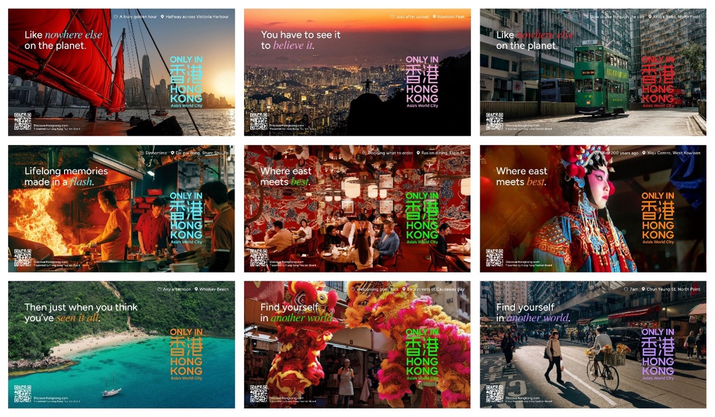
Only in Hong Kong. Photo Credit: HKTB
HONG KONG and LOS ANGELES, Sept. 09, 2026 (GLOBE NEWSWIRE) -- The Hong Kong Tourism Board (HKTB) unveils “Only in Hong Kong” (只在香港), a new global campaign that captures the sights, sounds, rich flavors and everyday moments throughout the city. The campaign reveals a Hong Kong that is made to be felt, where bustling energy and creativity meet secluded natural escapes and familiar traditions amid a constantly evolving cultural landscape.
Moving beyond polished, conventional destination imagery, “Only in Hong Kong” draws from real street scenes and recognizable details of life throughout the city, bringing its textures, colors, contrasts and vibrancy to the forefront. Star Ferry rides and skyline hikes, mahjong and local neighborhoods, hidden beaches and waterfront promenades, celebrated hotels and bars, and the pearlescence of the new Kai Tak Stadium all become part of a multidimensional portrait of Hong Kong and the moments that could only happen here.
That distinctly local point of view extends to the campaign’s visual identity, including a palette of 16 bold colors inspired by iconic elements of Hong Kong, with everything from the city’s transportation and coastline to its food, wildlife and skyline informing the creative system:
- Dukling Red – inspired by the timeless grace of traditional junk boats
- Red Bean Soup Maroon – symbolizing the joyful finish to a meal
- Egg Lamp Red – drawn from the distinctive light used to measure egg freshness in markets
- Sago Soup Purple – inspired by the dessert that brings a sweet finish to a night out
- Bauhinia Pink – reflecting the vivid way nature frames Hong Kong’s urban skyline
- Kai Tak Stadium Lavender – symbolizing world-class performance and a bright future
- Postbox Green – inspired by the familiar postboxes found throughout the city
- Ding Ding Green – celebrating more than 120 years of tram heritage
- Island Azure – drawn from Hong Kong’s 1,180 kilometers of coastline
- Dolphin Pink – inspired by the city’s rare pink dolphins
- Salted Egg Yolk – a nod to the golden center found in signature dishes
- Neon Green – capturing the energy of a city that never stops
- Skyline Blue – inspired by the skies above the towers lining Victoria Harbour
- Water Bay Blue – reflecting the lapping waters in the harbor and bays
- Panda Black and Panda White – celebrating the joy of beloved panda twins
The campaign’s new wordmark similarly takes cues directly from Hong Kong, fusing the luminous neon signage throughout the city with the timeless imprint of a traditional Chinese signature seal. Anchored by “Asia’s World City,” the identity brings heritage and energy together in a modern expression of a global destination shaped by the meeting of East and West.
A curious, witty and playful tone carries that personality into the campaign’s creative voice, with tongue-in-cheek lines including “Here, every day is an event” and “Where east meets best.” Together, the visual identity and voice of “Only in Hong Kong,” bring to life four qualities at the heart of the city’s appeal – Variety, Vibrancy, Contrast and World-class – celebrating a destination with no end of experiences existing naturally side by side.
“Only in Hong Kong” will roll out in phases across 22 source markets, beginning with high-impact digital and social media platforms before expanding across global and regional television, localized media channels and outdoor placements.
For more information and inspiration, visit DiscoverHongKong.com.
For media inquiries, please contact:
FINN Partners
Helen Ames / Sydney Mishkin
hktb@finnpartners.com
Hong Kong Tourism Board
Katie Roy
katie.roy@hktb.com
Senior Manager, Marketing & Public Relations
A photo accompanying this announcement is available at https://www.globenewswire.com/NewsRoom/AttachmentNg/78e804a2-c21a-4603-b3eb-f0f341ff6267